Case study
Gley.tv: Fixing the funnel that leaked 9 out of 10 signups
Macedonia's first streaming platform had traffic but no subscribers. I redesigned the website end to end: the old registration page was a page 9 in 10 visitors abandoned on sight, the new one was validated in 19 usability sessions and built to be finished, not fled.
72.5%
engagement rate from organic search, the redesign's highest-intent traffic
46.6%
site-average engagement rate since launch
- Gley.tv
- UX/UI Designer and team lead
- Division Marketing
- 1.5 months
- Research, analytics audit, competitive analysis, personas, user journeys, IA, wireframes, final designs, prototypes, usability testing
The challenge
People visited. Almost nobody subscribed.
Gley's old website had two problems working against each other.
An unclear value proposition. The site didn't explain what Gley actually was. Senior visitors, a core audience, often assumed it was cable TV.
Pricing that confused instead of convinced. Plans differed only by the number of simultaneous streaming devices. Users trained on Netflix expected content tiers, so the plans read as arbitrary.
The analytics made the cost of this concrete:
32.68%
of visitors never scrolled past the hero section
89.9%
bounce rate on the desktop registration screen
45.9%
bounce rate on mobile registration
The brief was a full redesign, from research to a developer-ready, user-tested prototype. I led the project team and owned every design decision end to end.
Decision 1
A hero that behaves like a movie, not a banner
A third of all visitors left without scrolling past the hero. I had three hypotheses: the hero wasn't interesting enough, the design felt like clickbait to visitors arriving from social ads, or both.
My answer was a cinematic hero. Instead of a static banner with a headline, the page opens like a title sequence: a video showreel of Gley's content plays first, the slogan fades in over it, and the navigation and CTA appear last.
The sequencing was the deliberate part. Delaying the nav and CTA is normally a conversion sin, but here the content itself was the strongest sales argument, so I let it speak before asking for anything. For an audience that associates streaming with television, opening like a movie also answers "what is this?" without a word of explanation.
Did it fix the scroll-off? The directly comparable metric no longer exists: GA4 fires its scroll event at 90% page depth, a far stricter bar than the old "past the hero" measure. What I can read is what the page feeds forward: the homepage carries two thirds of all site views and handed roughly 7,000 users into the registration flow.
Decision 2
Pricing that builds trust instead of raising questions
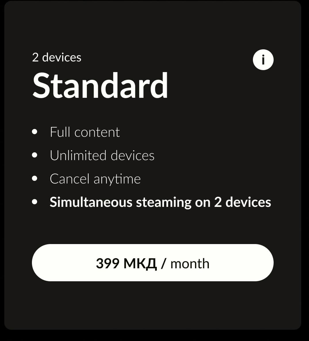
The plans couldn't change, so the communication had to. I redesigned the pricing cards around the one real differentiator: the number of devices streaming at once. That line got the visual weight. A title eyebrow named who each plan was for, bullets replaced paragraph text, and an info icon explained immediate billing before the checkout could surprise anyone.
Small changes, but they moved the cards from "what am I paying for?" to a transparent offer. Trust was the actual deliverable here.
The cards earned their validation qualitatively: in the 19 usability sessions, participants worked through plan choice as part of the full signup task, and the issues that surfaced were peripheral details like link visibility, not plan comprehension. The quantitative echo is downstream: plan choice sits in the middle of the flow that a third of arrivals now complete.

Understanding the problem
Who was Gley losing, and why?
I started with stakeholder interviews and user research, then condensed the findings into empathy maps. Four areas kept surfacing: onboarding, product features, support, and pricing.
Says
- “Where can I find the channels? Is this a cable TV service?”
- “Where can I see more information about the plans?”
- “Which of these is best suited for me?”
- “Is the only difference between the plans the number of devices?”
- “Will I have a larger content archive on a bigger plan?”
- “I want something that is safe.”
Thinks
- Is this a cable TV?
- I need more info on this
- Complicated approach, too little explanation
- Is any plan a good fit for me?
- This is harder than I imagined
- They really lack information
- Their customer support is not the best
- If I click on a package, will I buy it or get more information?
Does
- Searches for info on the plans
- Tries to register
- Fails to register through the mobile app
- Visits the website to activate the subscription through a telecom operator
- Requests customer support
- Can't find customer support except through email
- Contacts support but gets no feedback
- Gets the code rejected on mobile and tablet, because the subscription is made for a TV device
Feels
Says
- “Will I be charged without notice after the trial?”
- “How can I choose a package?”
- “Do I have to cancel after the trial month, or is it turned off unless I confirm?”
- “Will I stay on the same plan after the trial period ends?”
- “What if I choose a new package that isn't the same as the trial one and I don't like it?”
Thinks
- This is not clear and transparent enough
- They should introduce a trial period without withdrawal of funds
- Where is the customer support?
- Is there only one free plan?
- This is harder than I imagined
- What is this plan? What does it offer me?
Does
- Tries a free trial offer
- Enters billing information even though it's a trial period
- Tries to search content
- Plays an episode
Feels
Says
- “Where are the new episodes?”
- “The Macedonian translation is not working”
- “I keep having to re-choose the translation every time I log in”
- “It was not stated that there is limited content outside of Macedonia”
Thinks
- Lack of information
- They should introduce a trial period without withdrawal of funds
- This is not a good offer for me
- Is there only one free plan?
- Where can I complain about this?
Does
- Searches for a movie through the content filter
- Tries to play the movie
- Tries to search content
- Finds the film unavailable outside of Macedonia
- Tries to cancel the subscription
- Can't find a 'cancel plan' button
Feels
Says
- “I'm missing episodes of a series that have already been published”
- “Where are the new episodes?”
- “I want to find a better plan that offers me more favorable terms”
- “How and where can I change the plan?”
Thinks
- Untimely release of episodes and new movies
- They have outdated content
- How do I know which package is best for me?
- I'm waiting too much, is it worth it?
Does
- Tries to change plan
- Gets asked for a code by the system, but never receives one
- Turns to customer support
- Contacts customer support
Feels
The research settled into three personas:
- Nostalgia Seekers: 45+ fans of regional TV shows and movies. The most delicate segment, and the most likely to mistake Gley for cable.
- Savvy Parents: young families wanting safe, native-language kids' content.
- Domestic Binge-Watchers: viewers of all ages hungry for domestic shows.
Slavcho, 52
“Easy and as cheap as possible regional TV shows at hand.”
Background
Slavcho has been working in the national cadastre for 30 years. In the evening hours he enjoys watching regional TV shows. He isn't tech-savvy: skeptical, often confused when dealing with technology, and cautious with online payments.
Goals
- Enjoy favorite TV content in the evenings
- Navigate the website easily
- Get the best deal for the buck
- Not have to rely on torrent downloads
Needs & expectations
- Macedonian translation
- Intuitive, guided registration and onboarding
- User manuals and customer support
- Detailed guidance and instruction about the payment
+2 more
- Transparency in the presentation of the different plans
- Easy subscription cancelation
Frustrations
- Not tech-savvy
- Not an English speaker
- Mistrust in online payment protocols
- Complex registration and onboarding
+3 more
- Price
- Lack of good and efficient customer support
- Dependency on TV program schedules
Irina, 34
“Provide my children with both educational and exciting content in Macedonian.”
Background
Irina has been working in a bank for almost 10 years and is digitally very literate. A mother of two children (3 and 5 years old), middle class, currently trying to find a balance between work and personal life.
Goals
- Take a rest from her hyperactive kids
- Provide the children with fun content in Macedonian at any time
- Alone time
- Progressive, educated children
+1 more
- Keep up with the new Balkan TV shows
Needs & expectations
- Rich enough content to keep the children's attention
- Parental control
- Macedonian voice-over
- High-quality video and audio
+4 more
- Timely updated content
- Paying without facing technical problems
- Compatibility across all devices
- Download and watch offline
Frustrations
- Lack of free time
- Exhausted by the children
- Hard to find quality content for kids
- Difficulty finding Macedonian voice-overs
+2 more
- Finding time for her personal favorite TV show
- Guilty conscience when handing the kids a tablet
Lazar, 37
“Having domestic TV shows, films, and sitcoms at hand.”
Background
Lazar works in the public administration sector and is partially tech-savvy. He has a laid-back personality, lives a relatively relaxed life, and wants to fill his free time.
Goals
- Relax in his free time by watching interesting shows
- Enjoy domestic TV shows and movies
- Watch sitcoms
- Not depend on TV schedules
Needs & expectations
- Simple registration process
- Subtitles or voice-over for foreign content
- Transparency in pricing
- Timely updates of the content
Frustrations
- Irritated by ads
- Reluctant to go to a cinema to watch Macedonian films
- Partial English speaker
- Dependency on TV schedules
I mapped the Nostalgia Seeker journey (persona: Slavcho) through the existing site to find where the path to paying subscriber broke down.
Phase 1 · Facebook ad
Discovery
How a potential customer discovered the platform.
Actions
- Clicked a Facebook ad
Motivations
- Watch regional TV shows independently, without the help of his daughter
Questions
- “Is this a legit platform?”
- “Do they have my favorite shows?”
Pain points
- Not tech-savvy
Opportunities
- Raising brand awareness
Phase 2 · Internet browser
Consideration
The potential customer weighs the platform.
Actions
- Scrolls the landing page after understanding it is scrollable
- Looks at pricing plans and tries to click them
- Goes to 'See whole content'
Motivations
- Asks around if his favorite TV shows are on the platform
Questions
- “Is this cable TV?”
- “On how many devices can I watch?”
- “Is this worth it?”
- “Will I be able to activate this thing by myself?”
Pain points
- Struggles to realize what the platform is and what it offers
- Frustration when navigating the home page
- Struggles to understand pricing plans
Opportunities
- The hero section design should suggest legitimacy
- Pricing cards should be transparent and clickable
- Transparent showcase of regional content
Phase 3 · Internet browser
Decision
How the customer registered on the platform.
Actions
- Clicks the 'Register' button
- Verifies email
- Logs in
- Chooses a pricing plan
- Pays
Motivations
- To start watching
Questions
- “How should I register?”
- “What was my email password?”
- “Why can't I choose a plan? Was my plan automatically chosen?!”
- “Why should I log in again?”
Pain points
- Confusing registration flow
- Email verification
- Mistrust
Opportunities
- Place email verification at the end of the flow
- Choosing the pricing plan at the beginning of the flow
- Log the user in automatically after email verification
Phase 4 · TV · Internet browser
Experience
The experience of the user after using the platform.
Actions
- Activates device
- Plays favorite TV show
Motivations
- Find new shows
Questions
- “Why do I have to connect all my devices one by one?”
Pain points
- Struggles to find the needed user manual on the website
Opportunities
- Provide links to user manuals on the home page itself
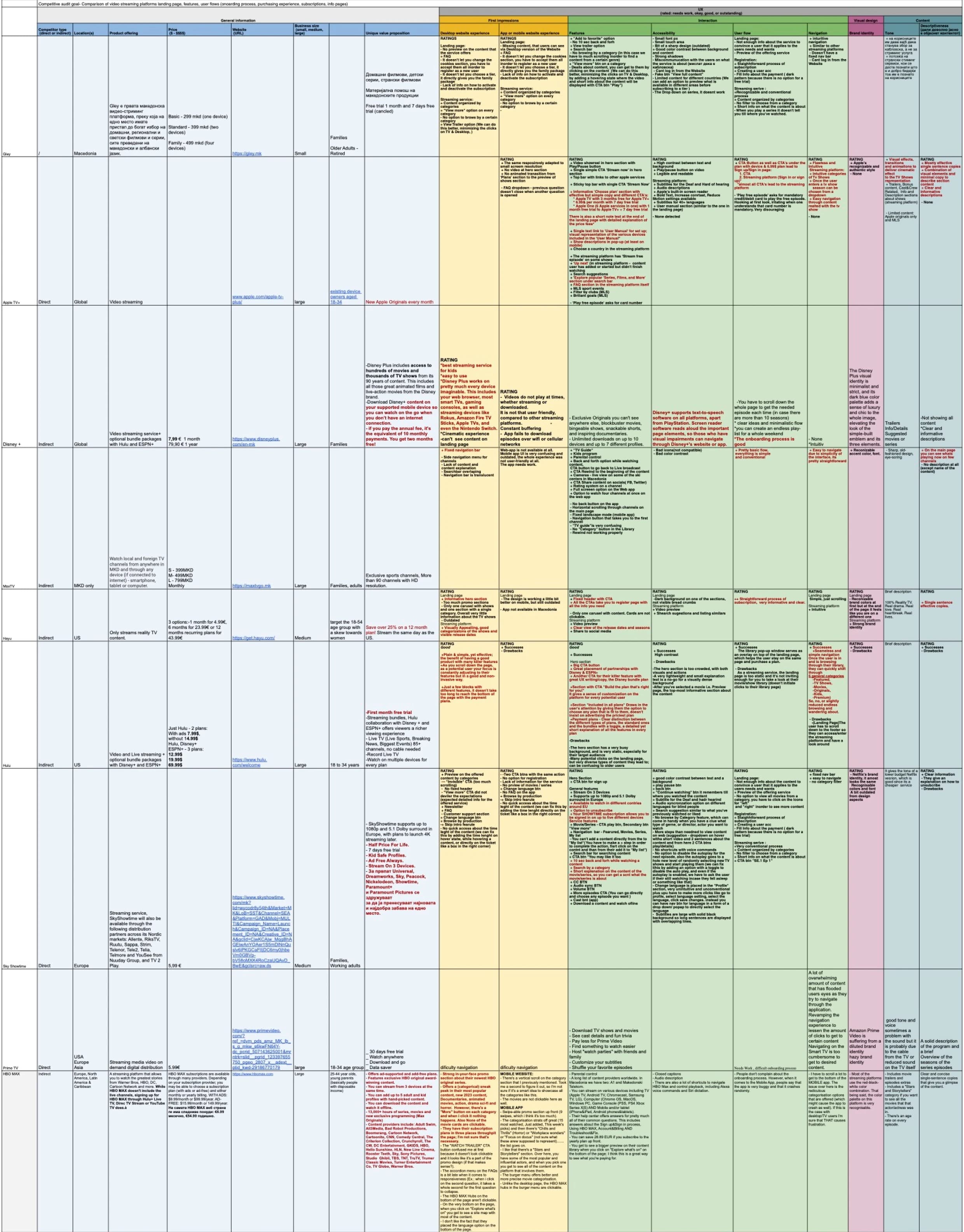
A competitive audit of the major streaming platforms gave me the checklist Gley was failing: clear value proposition above the fold, content organized by category, device compatibility made visible, trust signals like partner logos. None of it was rocket science. All of it was missing.
Home page
- Call-to-action
- Sign up
- Plan / email / password
- Card info
- Verification
- Log in
- Forgotten password
- Privacy policy
- Media center
- Terms of service
- Contact us
- Social media
- Help center
- Manuals
- New user
- Mobile login
- App installation and activation
- Pricing plan change
- Pricing plan change on mobile
- Subscription cancelation
- Subscription cancelation on mobile
- Choosing subtitle and voice-over
- Password reset
- Voucher activation
- FAQ
Decision 3
Moving email confirmation to the end of signup
The registration data pointed to one culprit: the flow demanded email confirmation immediately after entering an email address, sending users out of the funnel and into their inbox mid-signup. Most never came back. Desktop bounce: 89.9%.
I rebuilt the flow so every step keeps the user moving forward:
- Email & password. Contact info captured first, so even abandoned signups can be retargeted later.
- Choose a plan.
- Payment details.
- Personalization (optional).
- Email confirmation, at the very end.
The retargeting angle in step one was the business case that sold the change to stakeholders: an incomplete signup stopped being a lost user and became a marketing lead.
This is the decision the Results section measures directly.
Validation
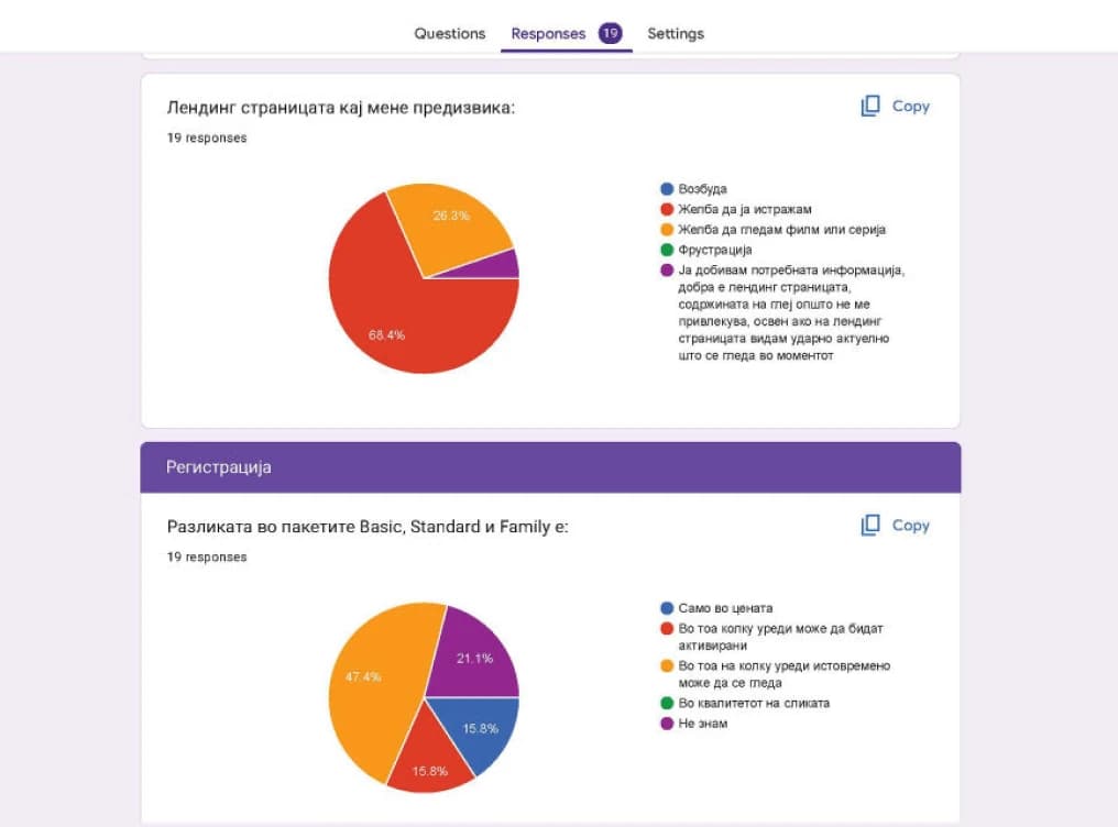
19 usability sessions before a line of code
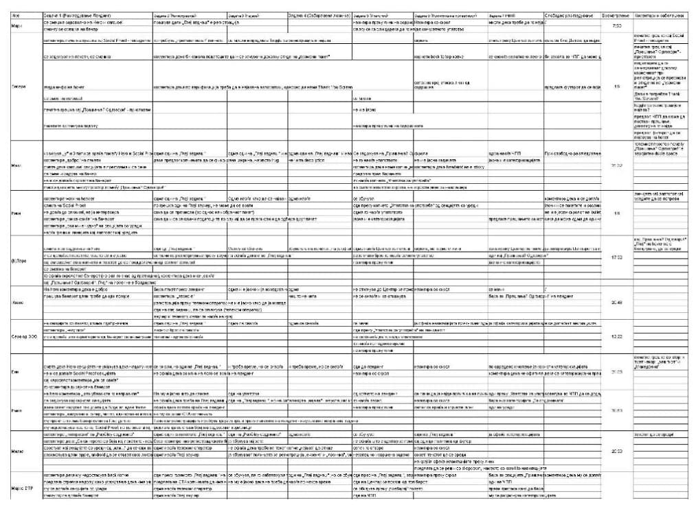
I designed the testing plan, ran 19 moderated sessions on the polished prototype, and closed each with a questionnaire. The sessions caught the small things that analytics never will, like text links some users couldn't find or comfortably read. By handoff, developers were building a design that real users had already worked through.
Results
A page people fled, replaced by a flow built to finish
All figures are from GA4.
9.3%
of organic-search visitors click through to start registration, the highest-intent traffic
~28,500
completed sign-up through the rebuilt flow
The clearest result is at the Register button. Visitors who find Gley cold, through organic search, click through to start registration more often than anyone else, including the returning visitors who already knew the brand.
That is the redesign doing its job. A homepage built to make "what is this, and why sign up" obvious draws its strongest Register click-through from the people who arrive without knowing the answer.
Lessons learned
Leading the team meant owning the trade-offs
This was my first time leading the whole project team, participating in every phase from research to handoff.
The sharpest test came with the hero. Marketing wanted the CTA visible immediately, and every instinct in the agency said don't bury the button. I argued the opposite: for an audience that thought Gley was cable TV, the content had to answer "what is this?" before we asked for anything, even if that meant holding the CTA back a few seconds. It was an uncomfortable call to defend, because if the numbers had gone the wrong way, the delayed button would have been the obvious thing to blame. I made the call, documented the reasoning, and owned the risk.
The flow's completion rate is partly the vindication. But the lesson wasn't that the position happened to be right; it was learning to hold a position I believed in against the room. I left the project trusting my own judgment more, and with the results to justify it.