Case study
A Fairytale Gone Wrong
Once upon a time, the biggest bank in the country asked design agencies for redesigned task flows. We showed up with three fully designed apps.
2 products
redesigned end to end by me: the personal banking mobile app and the web app
9 clicks to 2 steps
what happened to the payment flow
3 full prototypes in 10 weeks
from a team that was only asked for task flows
- The largest bank in Macedonia (under NDA)
- UX/UI Designer, owning 2 of 3 applications
- Division Marketing
- January to March 2023
- Research, IA, dashboard and payment flow redesign, feature proposals, full prototype, delivered as an RFP pitch
The ending has a twist. It's at the bottom. Here's the work.
The challenge
Three apps, one dated experience
The country's leading bank ran digital banking across three separate products: mBank (personal banking, mobile), mBankCo (business banking, mobile), and InternetBank (web, serving both). All three looked a decade old, and routine tasks felt like paperwork. Recognizing the problem, the bank issued an RFP inviting agencies to pitch redesigned task flows.
Decision 1
Task flows wouldn't win this. Full prototypes might.
We were an agency with no FinTech track record, pitching against firms with plenty. Matching them flow-for-flow meant losing on credentials, so we changed the game: instead of task flows, we would present fully designed prototypes for all three apps.
That decision set the pace for everything. Our UX department split into three teams, one per application. I took two of the three products: the personal mobile app and the web app. This case study covers my process, my decisions, and what I'd still defend.
Understanding the problem
Understanding our users
I started with internal research: a survey of colleagues who actually used the bank's apps. It gave us demographics, habits, and pain points fast.
68%
reported frustration with overly complex workflows
12%
couldn't make sense of crediting information
Core users were 18 to 35. Personal banking happened almost entirely on mobile, business banking on the web app, with little overlap. That split shaped the information architecture later.
Competitive landscape. I analyzed direct and indirect competitors in the country and the region to spot the gaps: features users wanted that nobody local offered well.
| Feature | The client | Erste | OTP | NLB |
|---|---|---|---|---|
| Account management | Yes | Yes | Yes | Yes |
| Bill payments | Yes | Yes | Yes | Yes |
| Money transfers | Yes | Yes | Yes | Yes |
| Mobile deposits | Yes | Yes | Yes | Yes |
| ATM & branch locator | Yes | Yes | Yes | Yes |
| Alerts and notifications | Yes | Yes | Yes | Yes |
| Card management | Yes | Yes | Yes | Yes |
| Personal financial management | No | No | Yes | Yes |
| Loan and mortgage applications | No | Yes | Yes | Yes |
| Security features | Yes | Yes | Yes | Yes |
| Customer support | Yes | Yes | Yes | Yes |
| Cardless transactions | No | Yes | Yes | Yes |
| Personalized offers | No | Yes | Yes | No |
| Financial education | No | Yes | Yes | Yes |
Two users, two mindsets. The research pointed to two distinct segments: individuals managing personal finances, and professionals handling money for businesses. I built a persona for each to keep design decisions anchored to real needs rather than stakeholder preferences.
Kristina, 32
“Streamline the banking tasks my workday runs on, efficiently and without visiting a branch.”
Background
A tech-savvy professional managing finances for a mid-sized marketing agency, with a master's degree in economy. Her job puts her on the bank's platform daily: her company is a client of the bank, and she holds personal accounts with it too.
Goals
- Save time and effort on everyday finances and banking tasks
- Gain better control over her financial situation and goals
- Fewer in-person bank visits, more efficient business processes
- A consistent experience across platforms and devices
Needs & expectations
- Routine tasks done fast: balances, payments, bills
- Online applications for loans and insurance, with loan tracking
- Budgeting features: expense tracking, spending insights, financial goals
- A smooth, intuitive interface with clear navigation and minimal friction
Frustrations
- The fund transfer and payment flow is confusing and time-consuming
- Can't cover all her business needs in-app; still visits the branch
- Features and information missing on some devices and platforms
- Far too many steps to complete a single payment
+1 more
- No way to apply for a loan online or track her current loans
Boryan, 24
“Payments and transfers in a few taps: secure, private, and never at a counter.”
Background
Lives in Skopje and works as a software engineer, the role he started right after his studies. Single, likes hanging out with his group of friends, and prefers digital interactions over anything that means standing in a branch line.
Goals
- Simple payments and money transfers, especially to friends and service providers
- A sense of security around his personal and financial data
- Save time by reducing complexity
- Avoid physically going to the bank
Needs & expectations
- A payment flow that makes person-to-person transfers effortless
- Strong, visible security measures
- A digital wallet inside the banking app, no third-party workarounds
Frustrations
- Face-to-face financial dealings; he prefers the distance of digital
- Payments and transfers in the app are slow and complicated
- The current navigation is counter-intuitive
Decision 2
One dashboard, two logged-in worlds
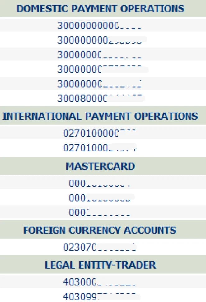
Every existing app suffered from convoluted navigation, so I rebuilt the information architecture for both of my products. The rule I set: reorganize aggressively, but keep the mental model familiar enough that a long-time user never feels lost.
InternetBank · web app dashboard
- Business banking
- Local currency payments
- Transactions
- Reports
- Cards
- Foreign currency payments
- Transactions
- Reports
- FX market
- POS terminals
- Credits
- Time deposits
- Applications
- Personal banking
- Local currency payments
- Transactions
- Reports
- Cards
- Savings accounts
- Foreign currency payments
- Transactions
- Reports
- FX market
- Credits
- Applications
- Gift cards
- Profile
- Personal information
- PUK code
- Change password
- My devices
- Subscriptions
- Change limits
- Dashboard widgets
- Accounts
- Cards
- Credits
- Recent transactions
- Notifications
mBank · personal banking app
- Dashboard
- Account balance
- Quick actions
- Quick payments
- My accounts
- Quick preview and balance chart
- Accounts
- Cards
- My savings
- My loans
- Loans preview and details
- Payment schedule
- Loan calculator
- Payments
- E-orders
- My templates
- Utility bills
- Foreign payments
- Internal transfers
- Recurring orders
- Bank services
- Exchange office
- Promotions
- My applications
- Bank locations
- ATMs
- Branches
- Digital kiosks
- Settings
- PIN and PUK codes
- My profile
- Logged devices
- Biometric authentication
- Customer support
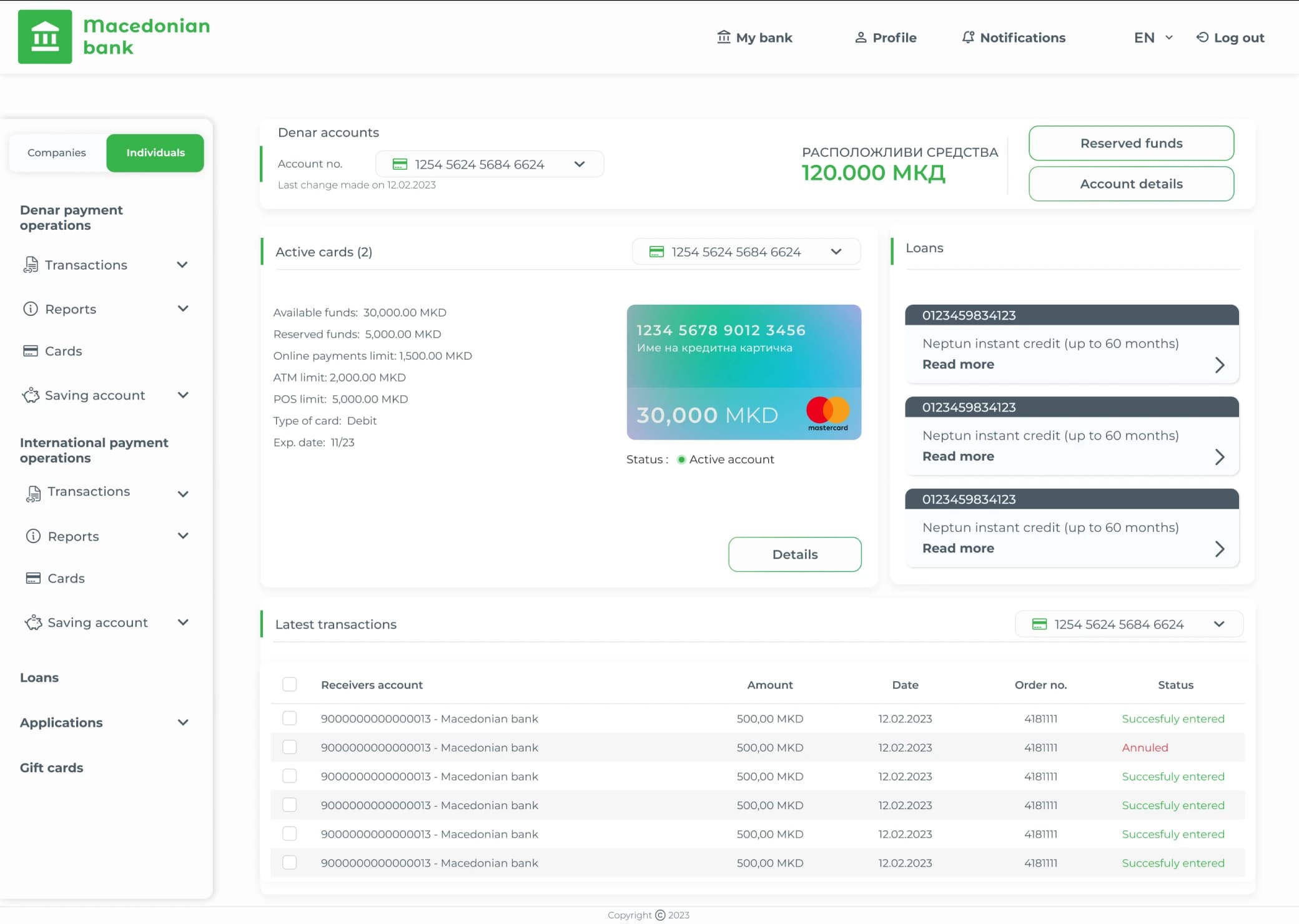
First screen, most-used features, zero digging. The dashboard is the first thing users see after login, so it earns the research-backed essentials: accounts, active cards, recent transactions, and a credits and loans section users explicitly asked for. I chose a master-detail layout: the sidebar gives quick access to features, the detail pane shows actions for whatever is selected.
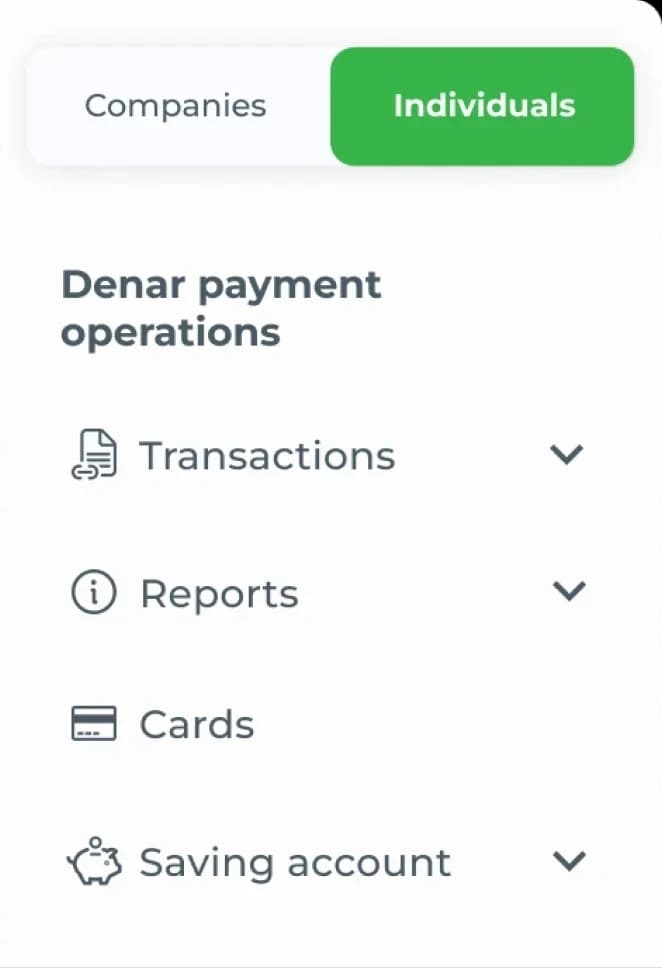
One login, two worlds. Legal regulations forced everyone to register as an individual, with business features unlocked by linking a legal entity. The old app handled this by stacking everything into one endless scroll. My solution: split the sidebar into "Individuals" and "Companies" tabs based on the user's login association. One click, and you're in the right context.
Decision 3
From a 9-click maze to two steps
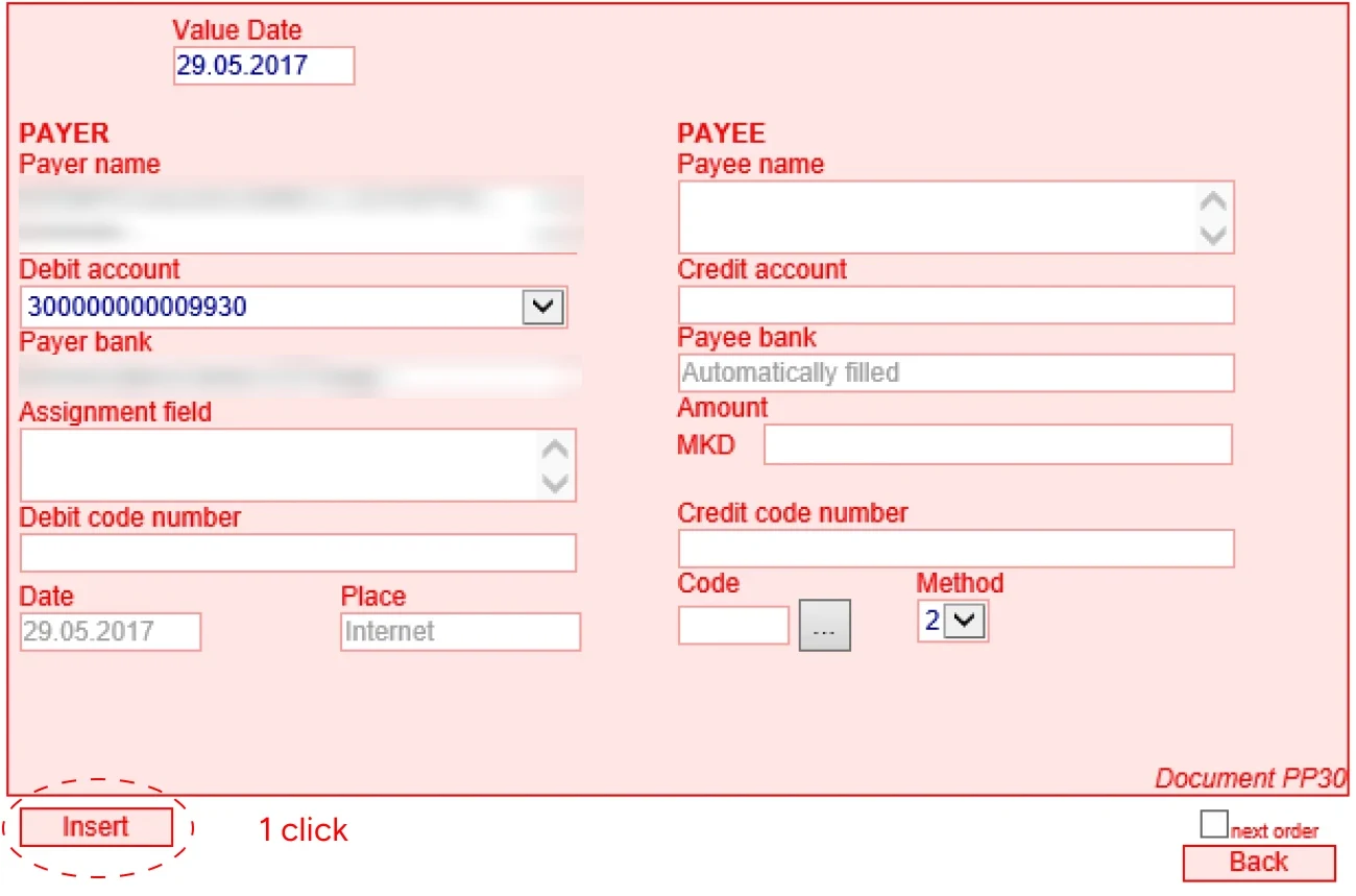
The old flow, in all its glory. Making a single payment worked like this: fill out an electronic order form, click "Insert" to file it under a tab called "Entry." Go to Entry, select the order, click "Send for signing," then navigate to the "Signing" tab. Select it again, click "Sign," which moves it to a "Realization" tab. Go there, select it a third time, click "Send for realization." Then refresh the browser manually to find out whether the payment actually went through.
9 clicks and 3 tab-hops
to make one payment, wrapped in confusing labels and no visual hierarchy
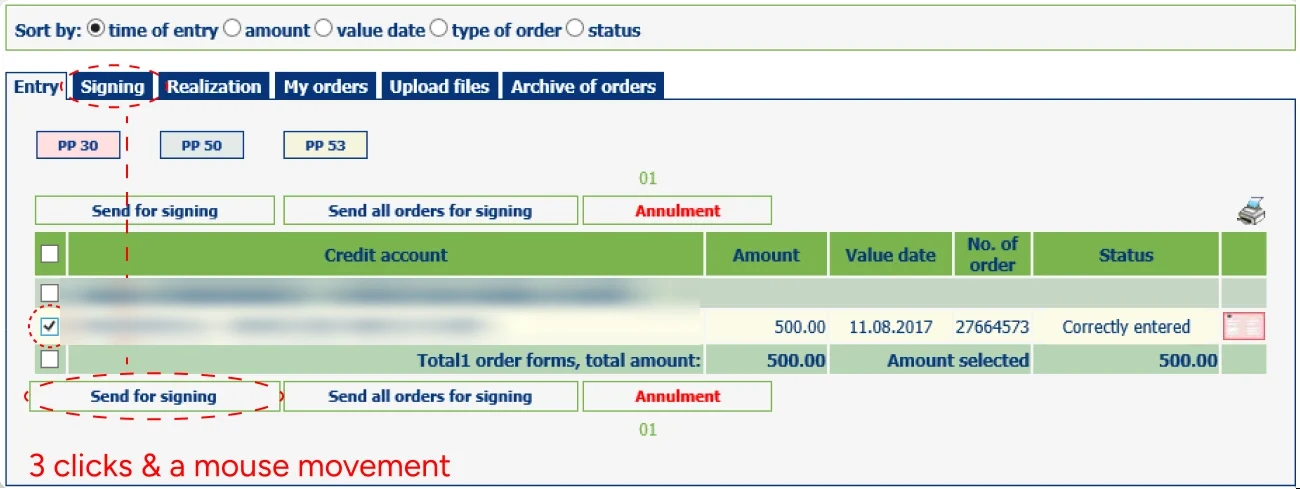
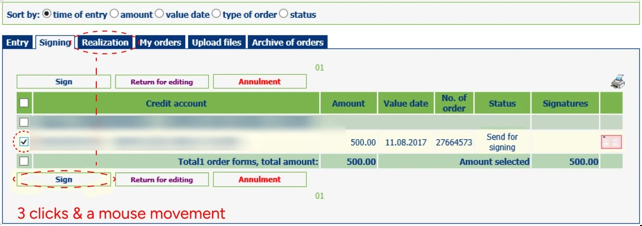
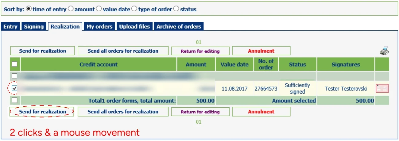
I mapped the entire process in a user flow chart first, which made the redundancy obvious: users were re-selecting the same order three times across three tabs.
Sign in
- Start
- Login screen
- Knows password?
- Two-step verification
- Enters the received code?
- Dashboard
- Forgotten password
- Username, email, phone + captcha
- Reactivation notification
- Back to login
- End
Create the order
- “Individuals” in the sidebar
- E-orders
- Payment screen
- Inputs payment details
- Proceeds?
- Transaction details
- Chooses from templates
- Batch: selects multiple orders
- End
Sign and confirm
- Signs the order/s?
- Payment successful
- New order?
- End
- Cancels orders
- Confirms cancellation
- Cancellation successful
- Back to the payment screen
The redesigned flow takes two steps. Create the order and confirm it, all on one screen, with templates and batch actions built in. Crucially, I preserved the task logic existing users already knew: same concepts, radically less friction.
Beyond the brief
Proposing what wasn't asked for
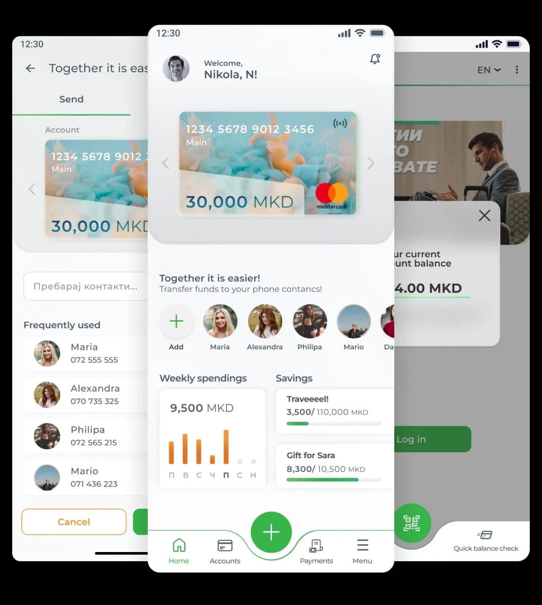
Research showed clear demand for effortless transfers, so the team and I proposed "Together it is Easier": send money to phone contacts who also use the app, and split bills and receipts directly in-app. The name plays on the bank's own tagline.
I also sketched a five-year roadmap: QR payments, a personalized secondary navigation for each user's most-used features, and biometric quick balance checks.
Results
This is the part where the fairytale goes wrong
We didn't win the pitch. The feedback pointed at our lack of FinTech experience, not at the work, which is both frustrating and fair: it was the exact risk our full-prototype bet was designed to offset. It got us into the room against firms with deep track records. It just wasn't enough to close.
Had it shipped, I would have measured it properly: task success rate and completion time on the payment flow, retention, and NPS, with the 68% workflow-frustration figure as the baseline to beat.
Lessons learned
The bet I'd still make
I'd still make the same call. And the project paid for itself in other ways: I designed two interconnected products under a 10-week deadline, ran research through final prototypes on both, and learned how far a small team can stretch when the format of the answer is itself a design decision.